Step one
Understand
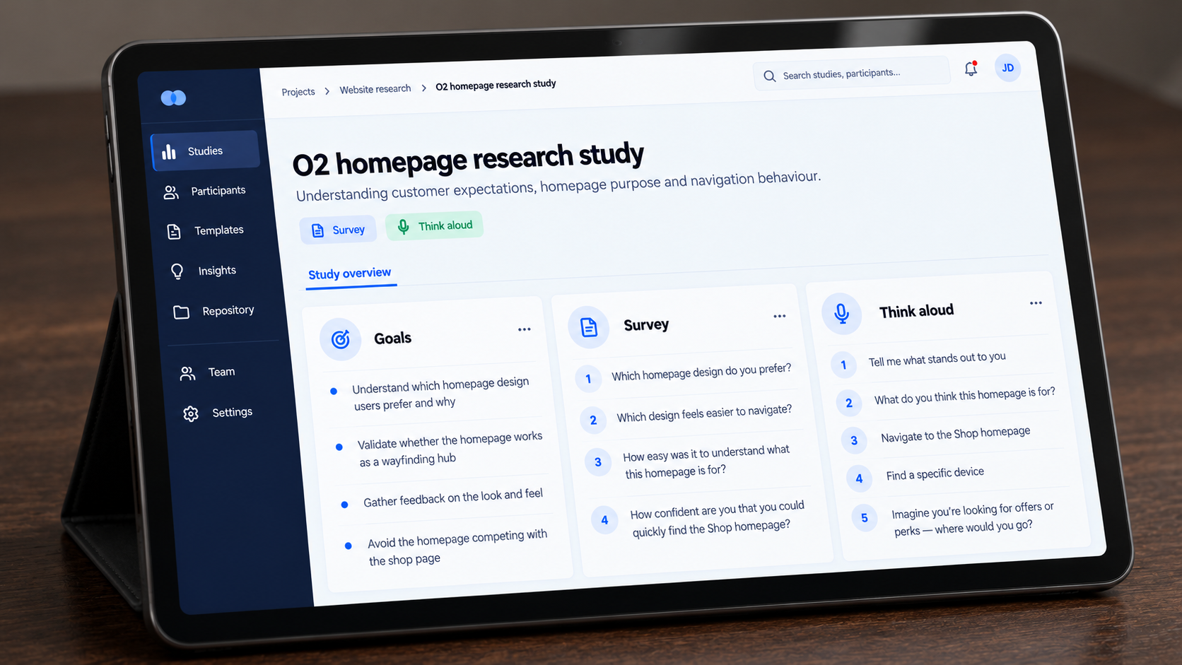
I created a questionnaire to explore what customers expected from the homepage, using their responses to identify priorities for discovery.
Case study
Helping customers find their way into O2.
I led research and design for a new O2 homepage, creating the questionnaire and testing two directions in UserZoom. I used the findings to refine category navigation, content priorities and the balance between discovery and routes into the shop.
01 The problem
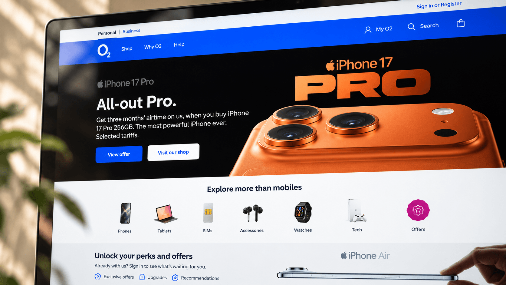
The homepage had become heavily promotion-led, making its role difficult to distinguish from the shop. Rather than treating this as a visual refresh, I reframed the problem around what customers needed the homepage to do: orient them, help them navigate O2 and make the wider brand easier to discover.

02 The approach
I created a questionnaire to understand what customers wanted from the homepage, then developed and tested two directions in UserZoom. The findings informed the final direction and a planned A/B test against the live homepage.
Step one
I created a questionnaire to explore what customers expected from the homepage, using their responses to identify priorities for discovery.
Step two
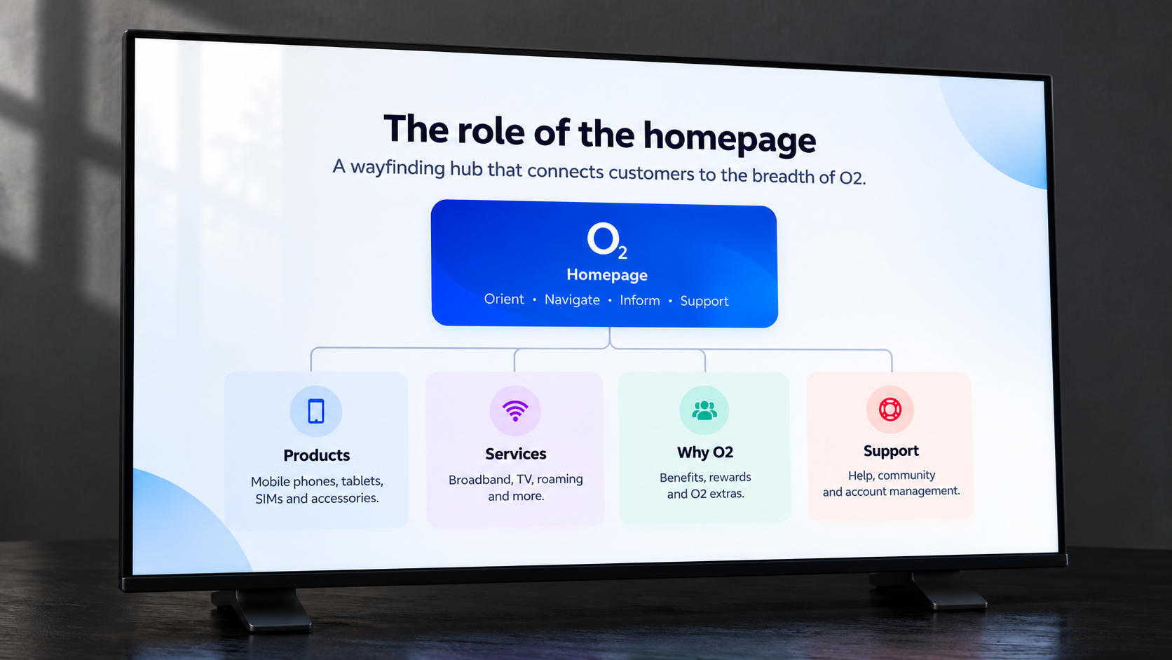
I used the findings to define the homepage’s role, combining direct shop access with clearer routes into O2’s wider offering.
Step three
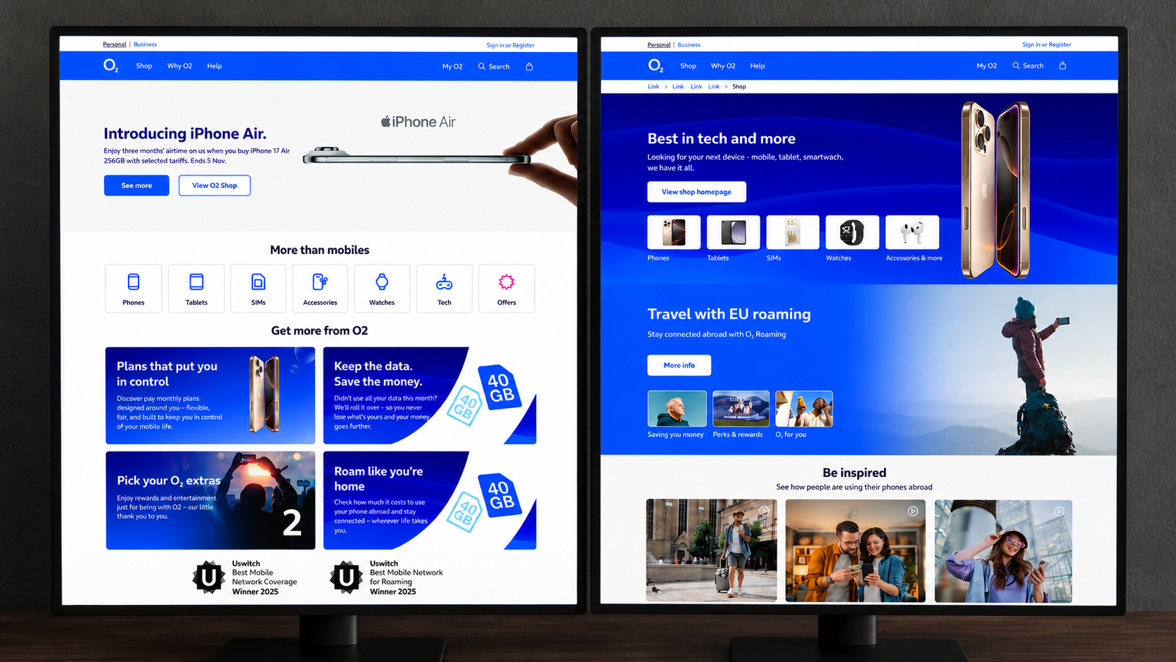
I tested two design directions in UserZoom, comparing navigation, category presentation and content choices to inform which direction to develop.
Step four
I refined the selected direction with Brand, CRO and development, focusing the content and making key journeys easier to find.
03 The decisions
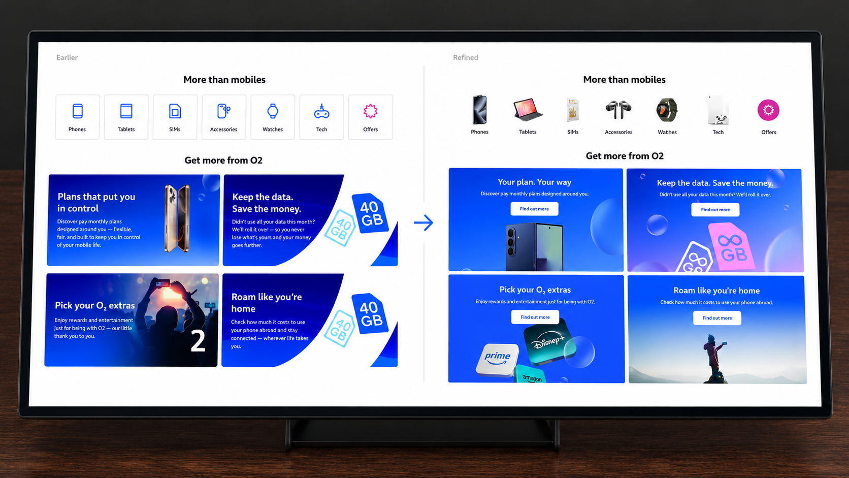
The questionnaire and comparative testing informed three decisions: a direct route into the shop, image-led category navigation and a more focused set of homepage content.
Homepage role
I gave the homepage a clearer role in orientation and discovery, with a direct route into the shop for customers ready to browse products or buy.

Wayfinding
UserZoom testing showed a preference for images over icons in category navigation. I used image-led links to make routes into phones, tablets, SIMs and accessories easier to recognise.
Content hierarchy
I used the research to prioritise the homepage content people found most useful, keeping a focused set of routes visible and leaving the wider offering accessible through global navigation.
04 The outcome
The design was completed and refined through UserZoom testing. A planned A/B test against the live homepage did not proceed after team changes, and the design was not launched.
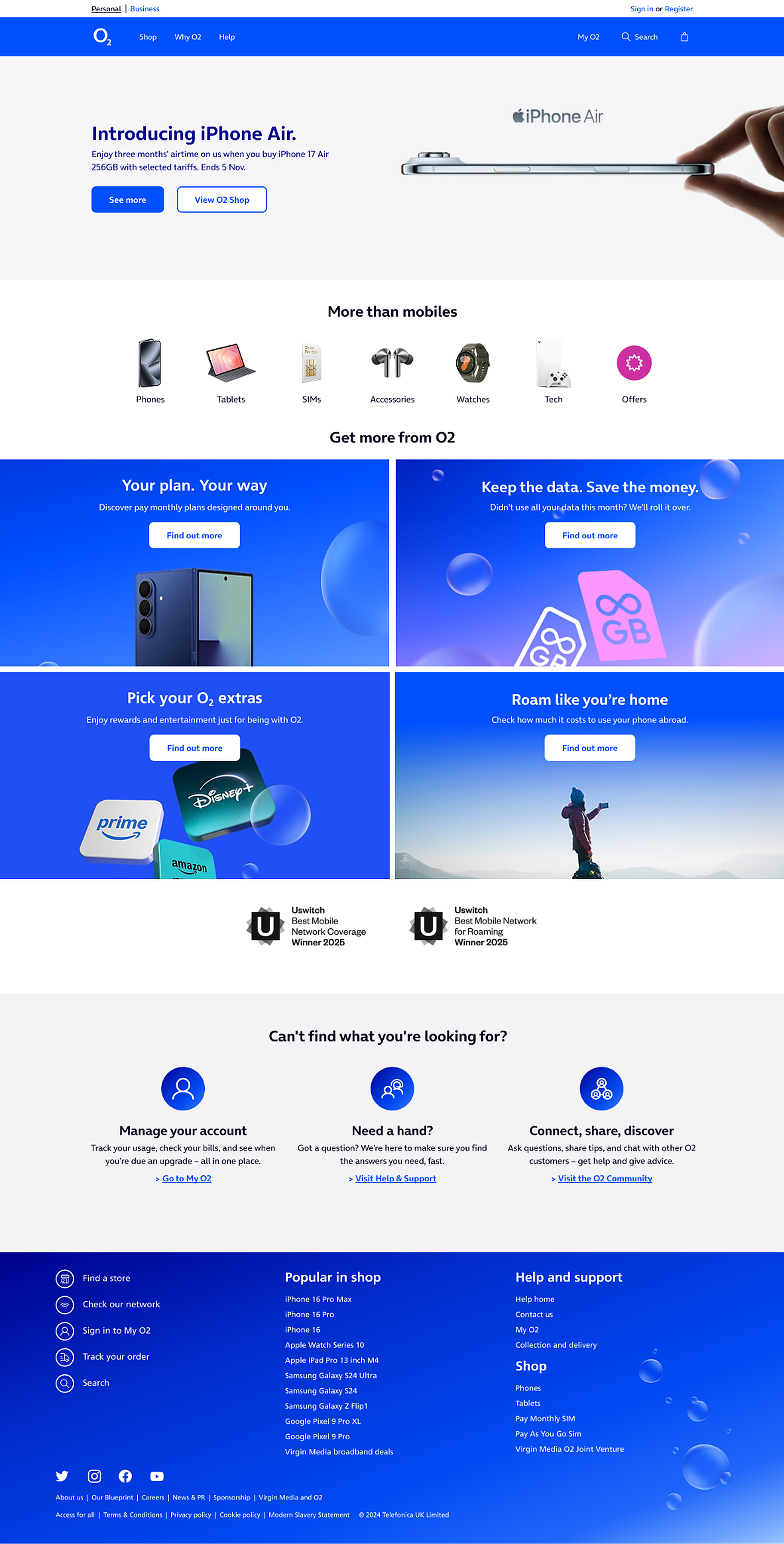
Defined routes into products, services and support give the homepage a clearer structure, helping customers identify where they can go.
The design makes space for more of O2’s products, services and benefits, extending discovery beyond the main promotional campaign message.
The design gives the homepage a role in discovery, while keeping product choice and purchase focused within the shop experience.
