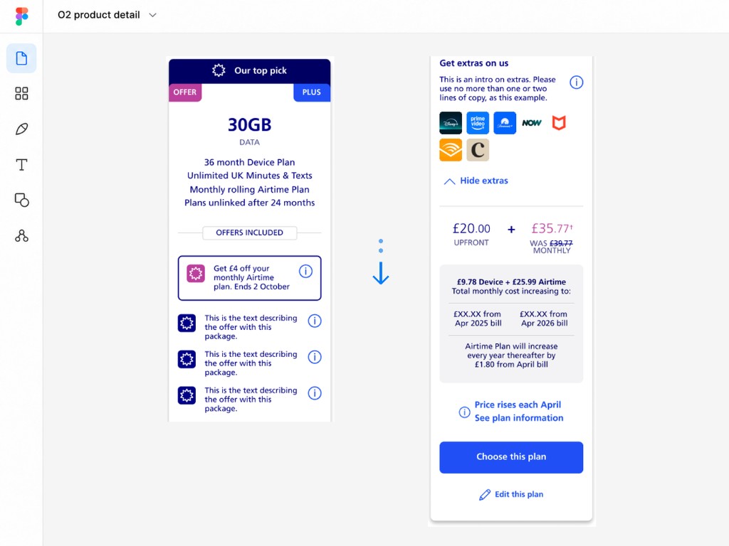
Product detail
Too much information at once
Customers were being presented with too much information during product selection, creating an opportunity to simplify the decision-making experience.
Case study
Improving product choice through design, direction and mentoring.
I redesigned O2’s tariff cards and supported the wider journey through design direction, mentoring and critique. Across product selection, configuration and checkout, I helped teams connect customer needs with commercial requirements and shared design standards.
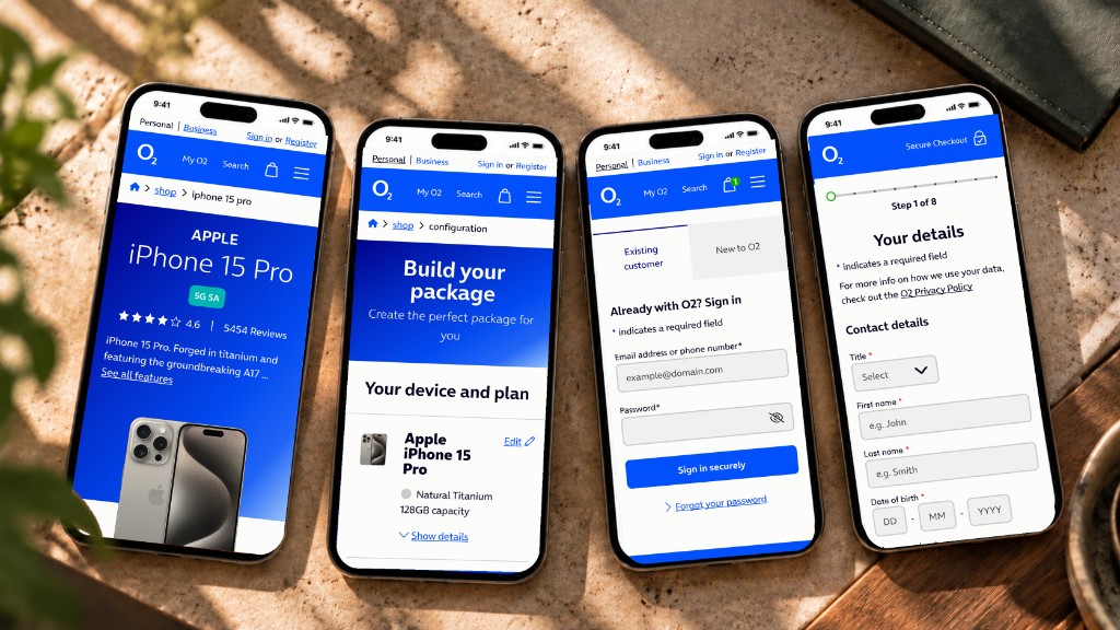
01 The challenge
The product journey crossed several independently evolving experiences, from choosing a product through to checkout. My role was to help designers identify the right problems, use evidence before moving into solutions and consider how decisions affected the wider journey.
Product detail
Customers were being presented with too much information during product selection, creating an opportunity to simplify the decision-making experience.
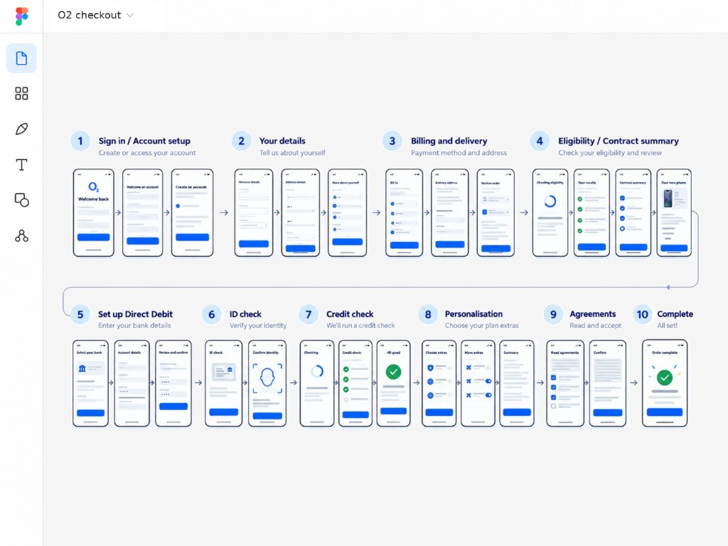
Checkout
Research indicated that checkout had become lengthy and fragmented, but the team needed to understand the real points of friction rather than simply remove screens.
02 My role
My contribution varied across the journey: designing directly where needed, helping other designers shape their work, and reviewing solutions against customer needs, commercial requirements and the design system.
Clarify the customer problem, challenge assumptions and establish what needs to be understood before the team moves into detailed design.
Bring research, CRO insight and journey behaviour together to identify friction, compare options and focus design effort on customer needs.
Support designers through constructive critique, helping them develop their judgement, refine solutions and retain clear ownership of the final design.
03 Product detail
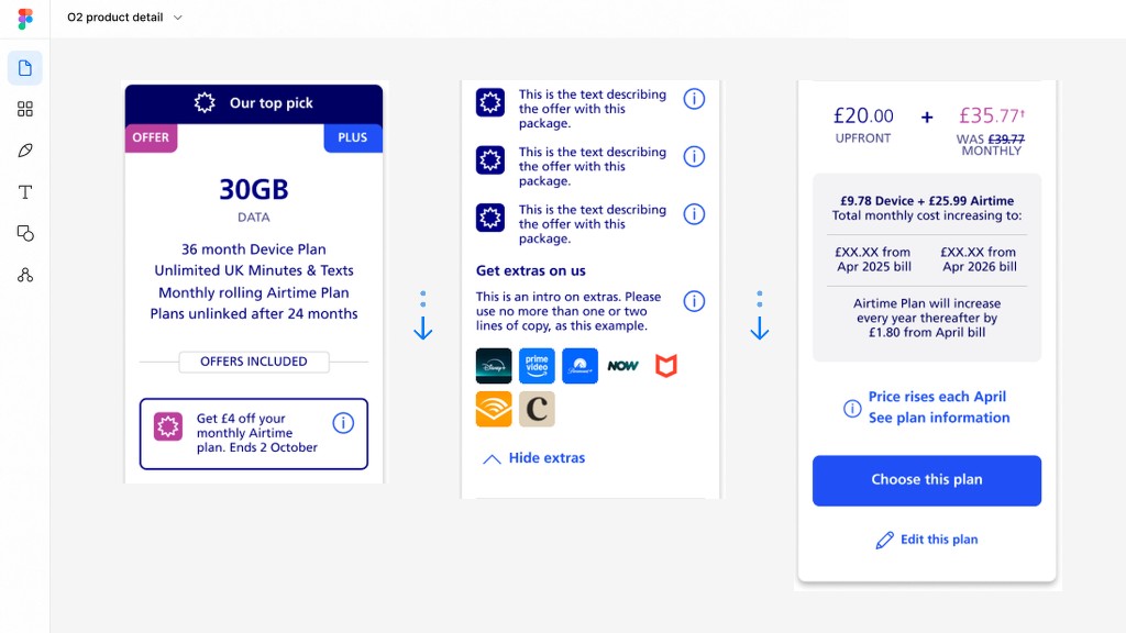
Customers were being presented with too much information at once within the tariff-card experience.
I designed the revised tariff-card solution. It simplified and prioritised the information so customers could understand the available options more easily and progress towards configuration.
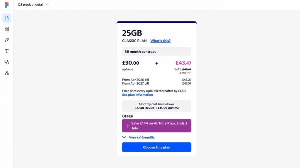
12 percent uplift in progression from product page to configuration
The optimisation team’s A/B test reported a 12% uplift in progression from product page to configuration following the tariff-card redesign.
In CRO testing
The next phase moves beyond optimising the existing card stack towards a more guided product configuration experience, helping customers make decisions in stages rather than being presented with everything at once.
I worked with other designers to shape the initial direction. As the work moved into CRO testing, I continued to review the evolving experience and feed back on the design. As my role changed, that review also included checking that the right design system components and patterns were being used consistently.

04 Checkout
Ongoing
Checkout restructuring is ongoing. The proposed direction groups the purchase into four clearer stages, while the team works through legal and financial requirements with design and delivery partners.
Step one
Basket, sign in / new customer, personal details, billing address, eligibility check and contract information summary.
Step two
Direct debit, ID check, upfront payment reservation and credit check.
Step three
Personalise package, spend cap, switching from another provider and service termination authorisation code.
Step four
Review purchase, pre-contract credit information, consumer credit agreement, pay monthly mobile agreement and order completion.
05 Impact / current state
Measured
The optimisation team’s A/B test reported a 12% uplift in progression from product page to configuration following the tariff-card redesign.
Testing
A broader product configuration direction is currently in CRO testing, helping customers make decisions in clearer stages rather than being presented with everything at once.
Ongoing
Checkout restructuring is continuing with design and delivery partners while legal and financial requirements are worked through.