Step one
Audit
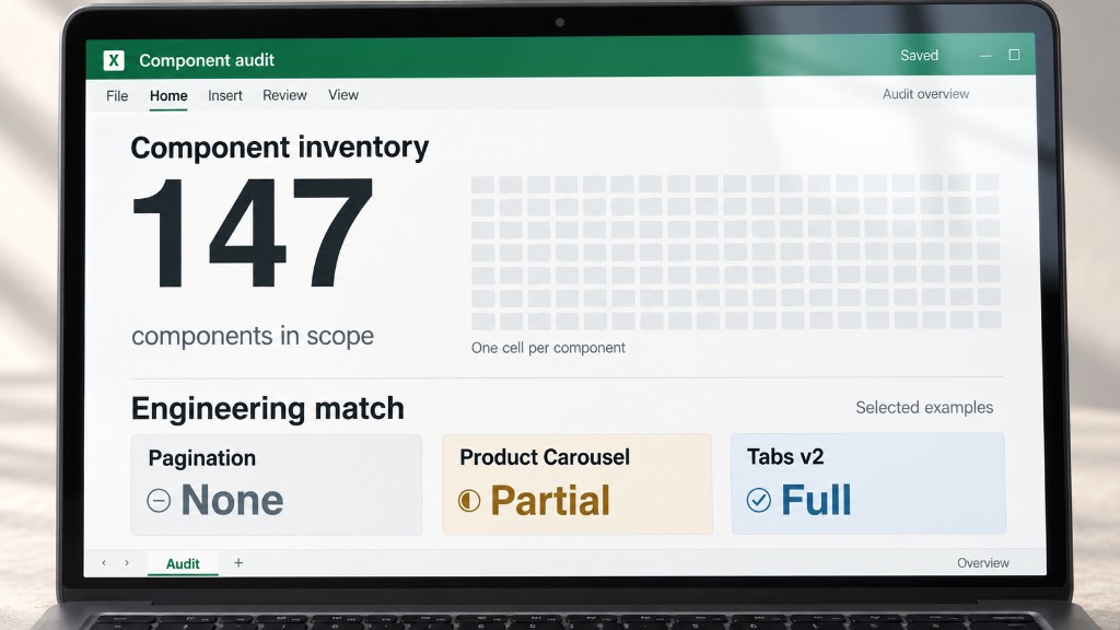
I mapped the library against live experiences and engineering parity to identify duplication, gaps and where design and build had diverged.
Case study
Making a shared system easier to use, govern and build.
As Central Design System Lead, I set the structure, guidance and governance for O2, Virgin Media and VMO2. I worked across Design, Brand, Product and Engineering to clarify what belongs in the system and how teams should use it.
01 The problem
The inherited library contained 147 entries, mixing core components, larger structures and patterns, with more solutions being created locally. Designers needed clearer routes through the system, while design and engineering needed a shared view of what existed, what could be reused and what needed rebuilding.
02 The approach
I led the audit and classification of the library, defined the shared architecture and set the documentation approach. Working with Design, Brand, Product and Engineering, I used reuse, live usage and engineering parity to guide what should be shared and what should stay local.
Step one
I mapped the library against live experiences and engineering parity to identify duplication, gaps and where design and build had diverged.
Step two
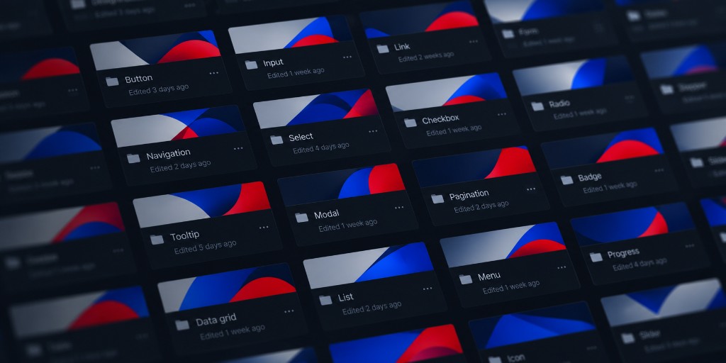
I reclassified the estate into core components, larger structures and patterns, based on reuse, live usage and engineering needs.
Step three
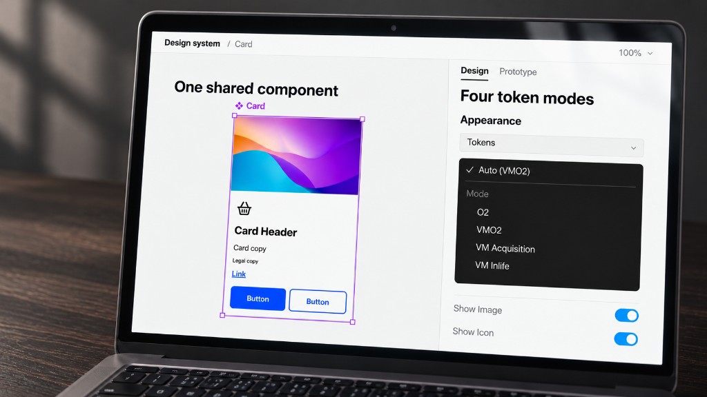
I defined a brand-agnostic core that adapts across O2, Virgin Media and VMO2 through tokens, working with Brand to preserve each brand’s expression.
Step four
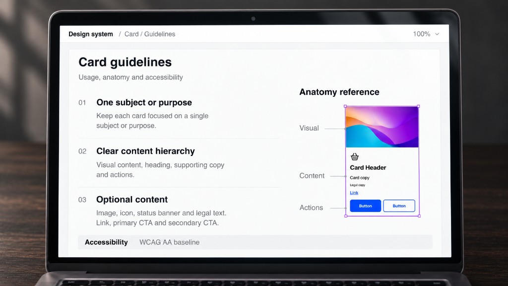
I set the documentation approach and worked with designers and Engineering to turn decisions into accessible guidance and Jira specifications.
03 The system rules
The system needed clear rules for classifying components, preserving brand expression and carrying accessibility requirements into implementation. I set guidance to help designers and engineers make those decisions consistently.
Decision framework
Each audited item was assessed against live usage, reuse and engineering parity to decide whether it belonged in core, structural, a shared pattern or a local solution.
Reuse, live usage and engineering parity are considered together to assess an item. The item is then classified as one of core, structural, shared pattern or local.
Inclusive by design
WCAG AA is the baseline, with accessibility and motion requirements built into component rules and reviewed during implementation.
Accessibility and motion requirements are set as rules, WCAG AA and motion, then applied in implementation. Review is where those requirements are checked and corrected.
I kept the reusable Card in Core and organised Product and Tariff cards as patterns. Each pattern combines shared components with the content, states and composition needed for its journey, allowing personalisation requirements to evolve without adding journey-specific rules to the core.
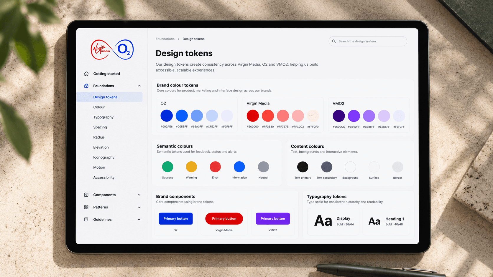
I imported the colour primitives and worked with Brand to agree how they mapped to tokens. I demonstrated the mapping in components and refined colours for button hover states and anchor links, giving interactive and static elements a clearer, consistent logic.
04 The outcome
The architecture, updated Figma components and Jira specifications are complete, with coded components and supporting Figma documentation now being brought into parity.
Components, structures and patterns have distinct roles, giving designers clearer boundaries when choosing, combining and maintaining the system’s reusable foundations.
A common component architecture uses tokens to express O2, Virgin Media and VMO2, keeping shared foundations separate from brand decisions.
Usage rules, accessibility guidance and Jira specifications make design intent explicit, supporting clearer conversations between designers, product partners and engineers.
05 See the system in action
Switch between Virgin Media and O2 to see how the same core components adapt.
Button
Anchor
Breadcrumbs
Filter Chip
Countdown
Status Banner
Selectable Card
Pagination Controls
Stepper
The demonstration uses coded CDS core components based on the real system specifications. Brand-owned typefaces are replaced with close alternatives for the portfolio while still demonstrating how typography changes between themes.